Mastering CSS Layouts: A Beginner's Guide to Flexbox & Grid

4
🧩 Understanding Flexbox & CSS Grid (Beginner-Friendly Guide)
Ever tried to align items in CSS and thought
“Why is this so hard?” 😵
Same here!
Let’s learn Flexbox and Grid in the simplest way possible 😊
👋 Introduction
Hi everyone 👋
This is another beginner-style article, written while learning CSS layouts step by step.
Today we’ll cover:
🧲 Flexbox → best for simple layouts
🧱 CSS Grid → best for complex layouts
❓ Which one should you use and when?
Let’s find out 👇
📌 What You’ll Learn
By the end of this article, you’ll understand:
✅ What Flexbox is
✅ What CSS Grid is
✅ Flexbox vs Grid (simple comparison)
✅ Two-column layout using both
✅ Common beginner mistakes 🚫
🧲 What Is Flexbox?
Flexbox is a CSS layout system used to align and distribute items easily.
💡 Think of Flexbox like:
Items arranged in a row or a column
One direction at a time → 1D layout
👉 Best for:
Navigation bars
Cards in a row
Centering items (very easy!)
🛠️ Flexbox: Simple Two-Column Layout
HTML
<div class="flex">
  <div class="box">Left</div>
  <div class="box">Right</div>
</div>
CSS
.flex {
  display: flex;
}

.box {
  width: 50%;
  padding: 20px;
  border: 1px solid #ccc;
}
📝 Explanation:
display: flex→ turns container into flexboxItems align side by side automatically
✨ Simple and clean!
🧱 What Is CSS Grid?
CSS Grid is a layout system for rows AND columns.
💡 Think of Grid like:
A table or spreadsheet 📊
2D layout (rows + columns)
👉 Best for:
Page layouts
Dashboards
Complex designs
🛠️ Grid: Simple Two-Column Layout
HTML
<div class="grid">
  <div class="box">Left</div>
  <div class="box">Right</div>
</div>
CSS
.grid {
  display: grid;
  grid-template-columns: 1fr 1fr;
}

.box {
  padding: 20px;
  border: 1px solid #ccc;
}
📝 Explanation:
grid-template-columns→ defines columns1fr 1fr→ equal width columns
🎉 Layout done with full control!
⚔️ Flexbox vs Grid (Beginner View)
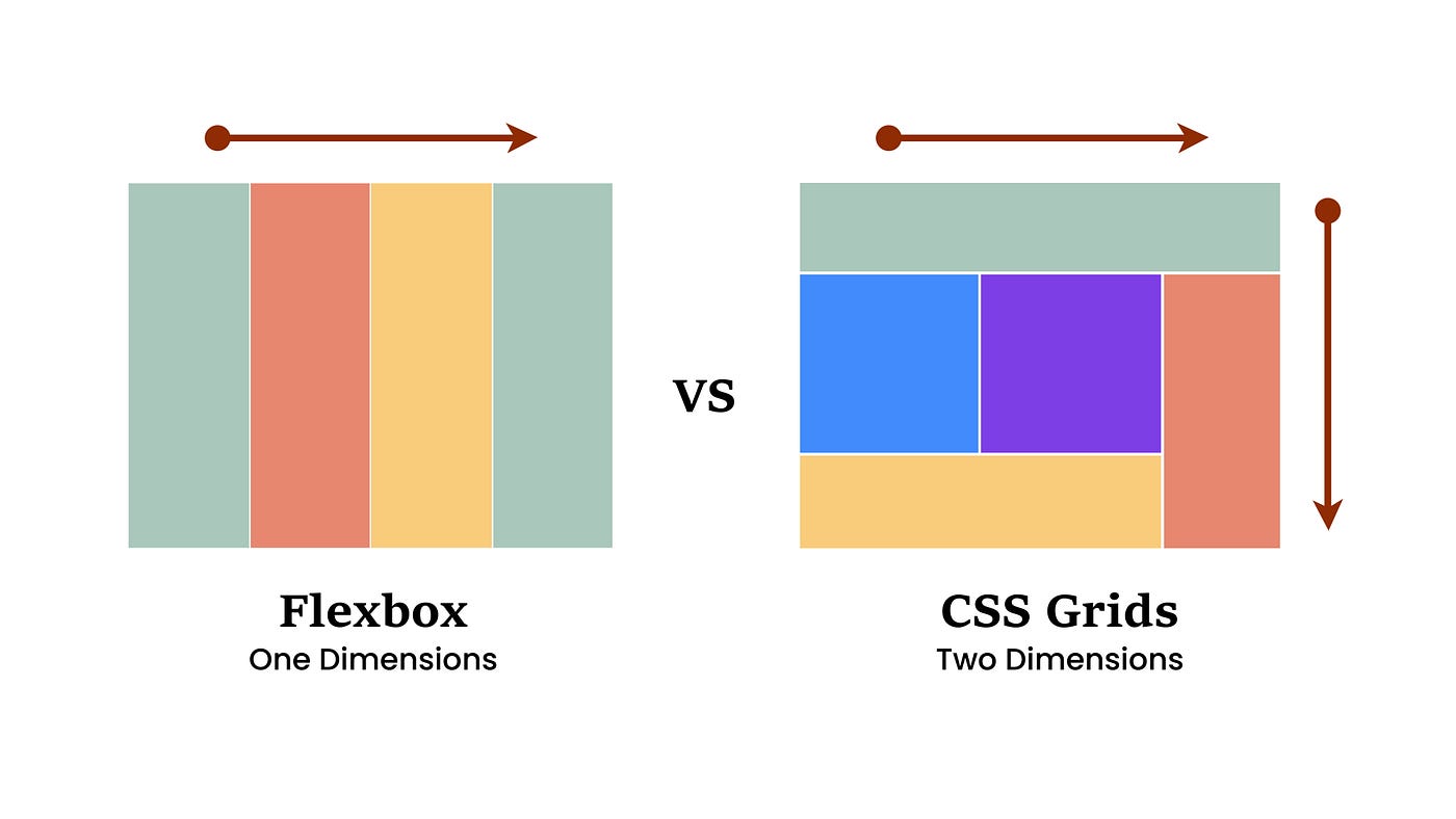
| Feature | Flexbox | Grid |
| Dimension | 1D | 2D |
| Ease | Very easy | Slightly harder |
| Best for | Small layouts | Page layouts |
| Learning curve | Low | Medium |
❓ Which one should you learn first?
👉 Flexbox first, then Grid 👍
🎨 How Layout CSS Improves a Webpage
Without Flexbox/Grid 😐:
Messy layouts
Hard to align items
With Flexbox/Grid 😍:
Clean design
Responsive layouts
Less CSS code
🚫 Common Beginner Mistakes
❌ Using Grid for everything
❌ Forgetting display: flex or display: grid
❌ Confusing Flexbox direction
❌ Not understanding when to use which
👉 Tip:
Flexbox → components
Grid → page layout
⚖️ Pros & Cons
✅ Flexbox Pros
Easy to learn
Perfect for alignment
Less code
❌ Flexbox Cons
- Not ideal for complex layouts
✅ Grid Pros
Full layout control
Clean structure
Powerful
❌ Grid Cons
- Slightly harder for beginners
💰 Price & Value for Money
Cost: Free 💯
Browser support: Excellent
Value: ⭐⭐⭐⭐⭐
Flexbox + Grid = Must-know skills for frontend developers 🚀
🧪 Try This Mini Task
👉 Build a two-column layout
👉 First with Flexbox
👉 Then with Grid
❓ Which one felt easier to you?
🧠 Key Takeaways
Flexbox = one direction
Grid = rows + columns
Learn both, use wisely
Practice makes layouts easy 💪
🙌 Final Thoughts
CSS layouts feel scary at first — but once Flexbox and Grid click,
designing becomes fun 🎨✨
❓ Should I write next about responsive design or media queries?
Thanks for reading ❤️
Happy coding & keep learning! 🚀


